Blog

Insights from your JIRA data to help improve your team

04 Apr, 2024
Xebia Background Header Wave

Many teams are using Atlassian’s JIRA as an issue tracker, which then becomes a valuable source of information for their daily operations. As a team leader utilizing JIRA, you probably have employed JIRA dashboards to monitor the status of work, usually in context of a (release) planning. However, these dashboards often hardly help you becoming aware of structural inefficiencies in your organization.

Therefore, we have selected three different views on JIRA data that have proven their value in different organizations. They provide insights for you to make better informed decisions, in order to continuously improve your developer experience and team productivity.

Please remember, that data, while powerful, is context-dependent and only shows a part of the truth.


Process mining status changes

By analyzing the history of Jira issues, we can map out the actual flow of tasks and issues. This reveals what statuses are used most often, and the time spent in each status. This presentation sometimes resemble an automated value stream map.
We tend to look at this chart per issue type – as epics, stories and bugs tend to have a different flow or lifespan. Also, to make this chart readable, we tend to leave out the least-used status transitions.


Insights from your JIRA data: A graph showing status transitions for an issue type
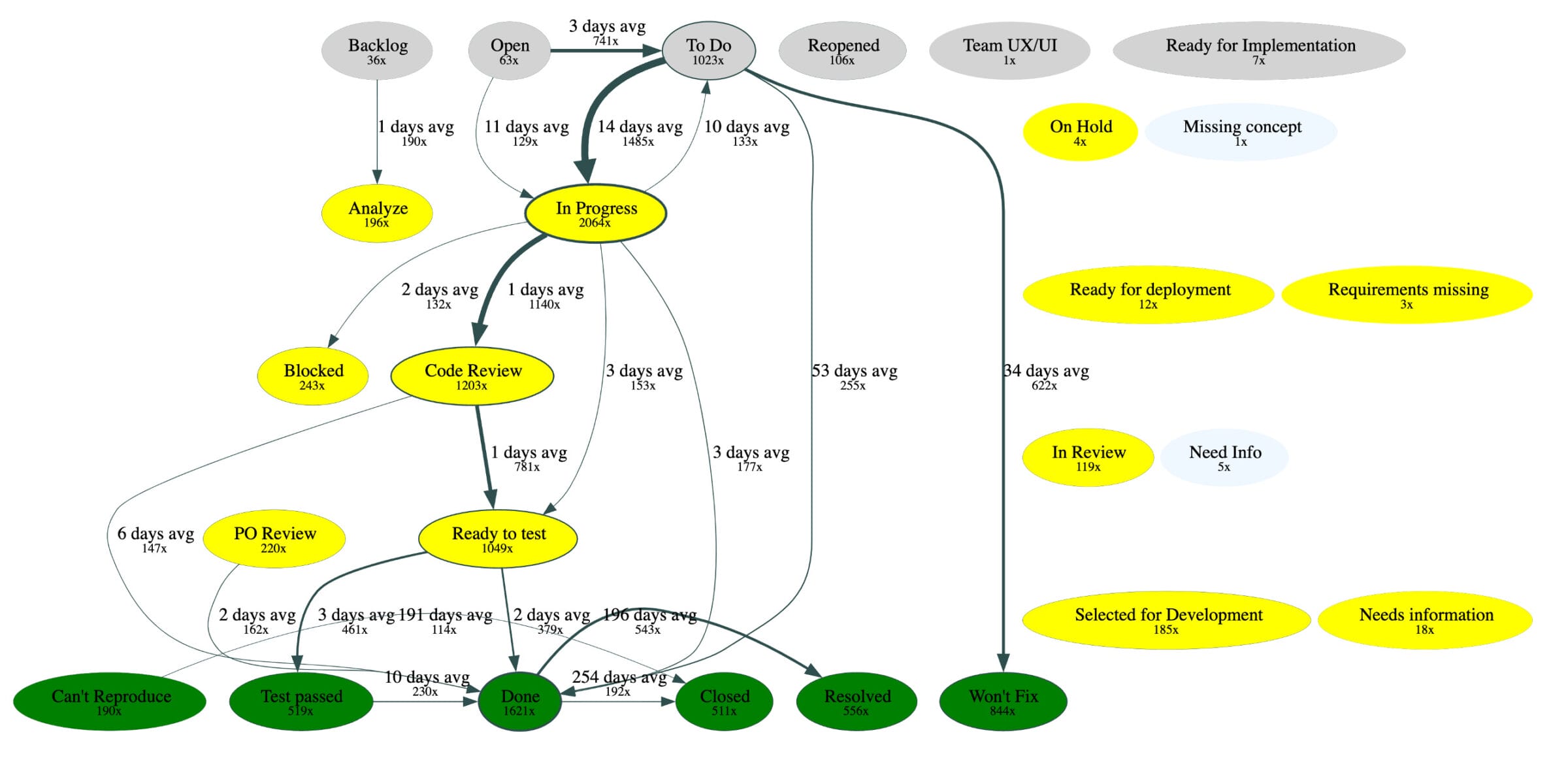
Example: Showing the statuses, the transitions between them with the average time between them. Colors represent the status category. 

Insights we get from this include:

  • Collaboration: Jira statuses are often used for handing off work. Having a lot of statuses often come with delays and siloed work, rather than collaboration.
  • Delays: By quantifying the time intervals between statuses, we can identify areas for optimization. Some examples:
    • It’s not uncommon for us to observe a ‘testing’ status to take longer to complete than the actual implementation, often this relates to hand-offs, poor testability, or an inefficient test strategy.
    • Refinement status might be overly short or skipped over entirely. If we later see that a lot of completed items need a rework, we can investigate whether the team does not have time for refinement at all or business stakeholders are unavailable to provide information.
  • Rework: It is important to look out for arrows going back to previous statuses. If the frequency of such occurrences is high, it indicates room for improvement.
    • For example, a recurring loop from ‘testing’ to ‘in development’ often points to late-stage bugs due to inadequate test automation or unclear requirements.
  • Reality checks: Often, a process is designed with many statuses. An important insight we get is whether this design is genuinely followed. For example:
    • Unused or rarely used statuses might not add any value, and can be considered to be removed.
    • Sometimes teams might skip a status altogether (an average lead time of 0 minutes). In this case, the designed process doesn’t match the reality.
    • Some ideas may stay in the backlog for extended period of time, before they are cleaned up (i.e. “won’t fix”). Consider to more actively reduce them.
  • Historical comparisons: Comparing a version of this chart throughout the years (now vs 3 years vs 5 years ago) may provide important information on whether there were any improvements in the last years or not.


Issue creation over time by current status category

A histogram chart showing the number of issues created over time, colored by their current status categories, has proven to be an insightful chart. Again, we usually look at this chart per issue type. In JIRA, often custom statuses are being used, but these all belong to a "status category".

This chart tends to address questions like: can the team keep up with incoming work?

Insights from your JIRA data: An example histogram showing issues created over time, colored by status category 
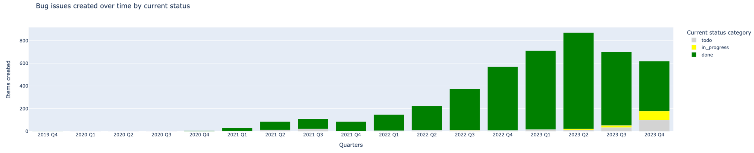
Example: A histogram of the bugs created colored by the status category.

Insights we get from this include:­­

  • Issue Creation Trend: The trend of issue creation itself may tell a lot. Maybe the number of created stories is declining because a project comes to its end. Perhaps the number of incoming bugs keeps growing and we need to take measures to deal with it.
  • Issue Age: By adding the current status of the issues, we can get an idea of the age the issues are being worked on. If the team is only working on old issues, they might be struggling to keep abreast of current needs of the market.
  • Issue Balance: The balance between the completed and incomplete issues is a robust project health indicator. If the number of incoming issues is increasing while the team focuses solely on older ones, it will likely become even more challenging to regain momentum.


Work in progress trend

Too often, we see teams working without common goals and a focus to finish these. Instead, they work on different things and multi-task and the actual delivery is suboptimal. Often, we recommend putting limits in place on work-in-progress, but even then, analyzing the trends can reveal suboptimal flows and points of attention.

 On a specific note, our definition of work-in-progress isn’t only the work in the ‘in progress’ status category. Instead, we work that went back from ‘done’ or ‘in progress’ to ‘todo’. So, we consider work that’s actively in progress, but also work that was started but not finished.

Insights from your JIRA data: An example trend line that shows the number of issues in progress over time, where the line continues to go up

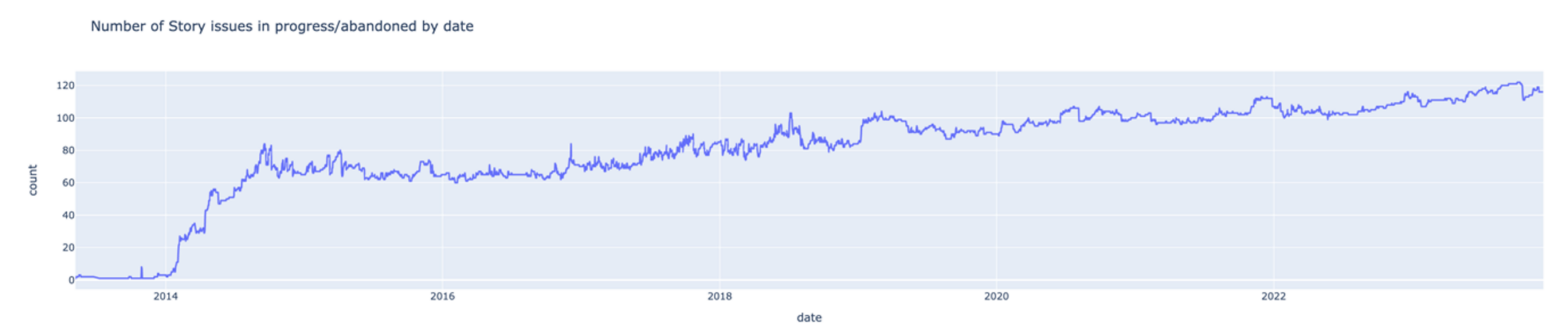
Example: The Stories in-progress growing over time

Insights we get from this include

  • Work in progress trends in the long term: When the work in progress keeps growing, it is likely the team would benefit more from more focus on finishing things and it we would recommend to discover what keeps issues in progress.
  • Work in progress trends during a sprint: On some occasions we see might another pattern in the line, where the work in progress strongly dips very close around every sprint end. While, in general, it’s good to finish things in a sprint, it’s also important to reflect on potential reasons, perhaps quality gets comprised in favor of meeting the deadline, or the workload can be distributed better throughout the sprint, or perhaps the administration of work is only updated by the end of the sprint.

Conclusion

As we hopefully illustrated, navigating wealth of data available in your JIRA issue tracking system requires precision and strategic approach.  While existing JIRA dashboards can give a snapshot of current operations, but delving deeper into data can provide a historical perspective on your performance.

Examining issue flows and historical patterns of your software development process can offer transformative insights into efficiency of your organization and potential bottlenecks in your process:

  • Do we know whether our testing process is efficient enough?
  • Can we react to the market requests in time and get needed features in production fast?
  • Is our backlog management efficient enough?

Whether you’re just starting this analytical journey or are deep into data-driven strategies, there’s always a narrative waiting to be discovered in the numbers.

We’d welcome you to reach out to us if this article helped you in any way, would like to know more, or simply have a good conversation and a cup of coffee. 


Update 04-04-2024

We open-sourced part of the JIRA analysis as part of DevLake. See our blog post:

https://devlake.apache.org/blog/DevLake-Playground-How-to-explore-your-data/


This blog is part of our series "Holistic Horizons". Check out the previous entry – "Mending the rift between business stakeholders and development teams” by Dmitry Litosh. 

Questions?

Get in touch with us to learn more about the subject and related solutions

Explore related posts